

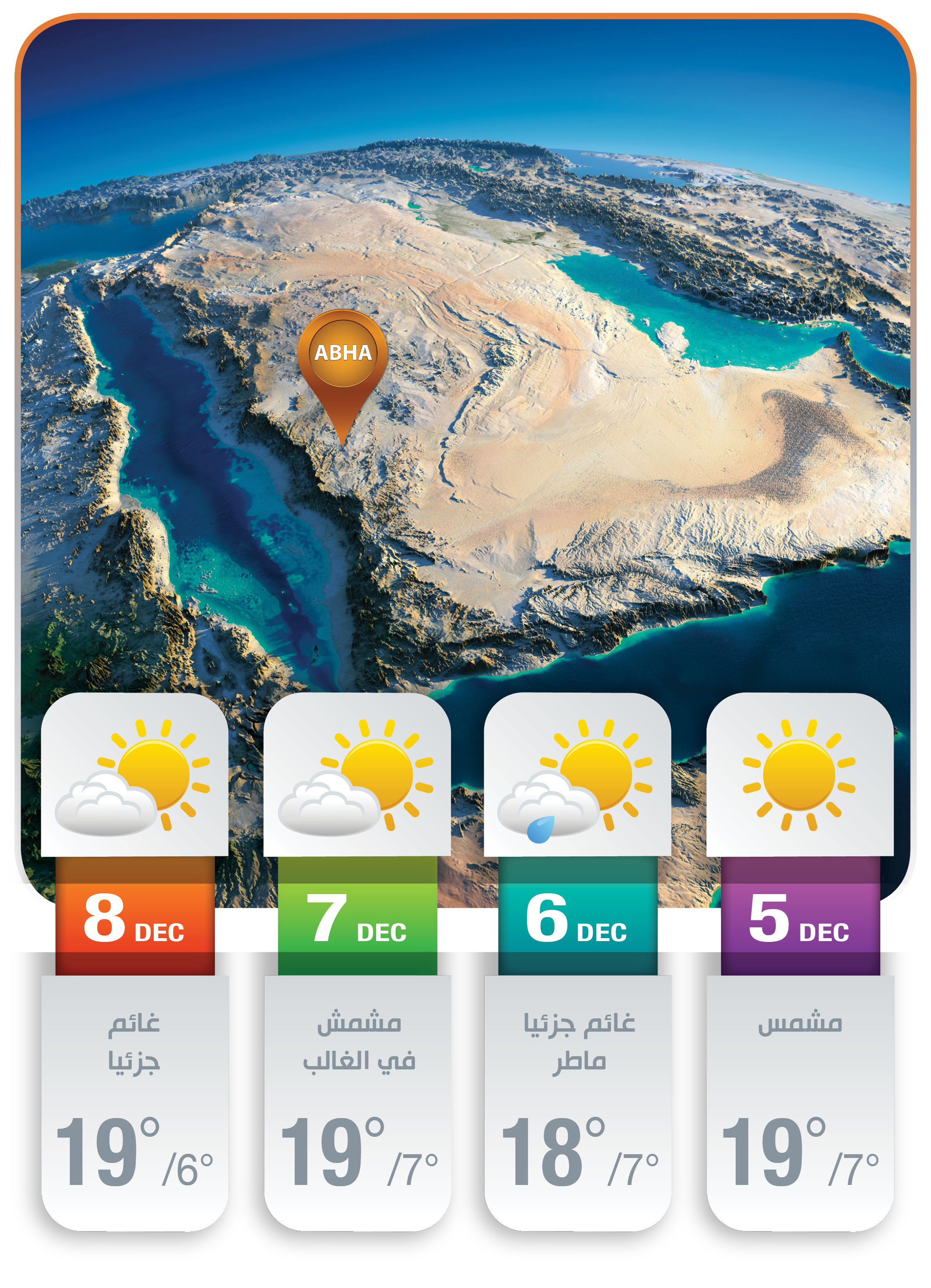
طقس ابها ايام المؤتمر
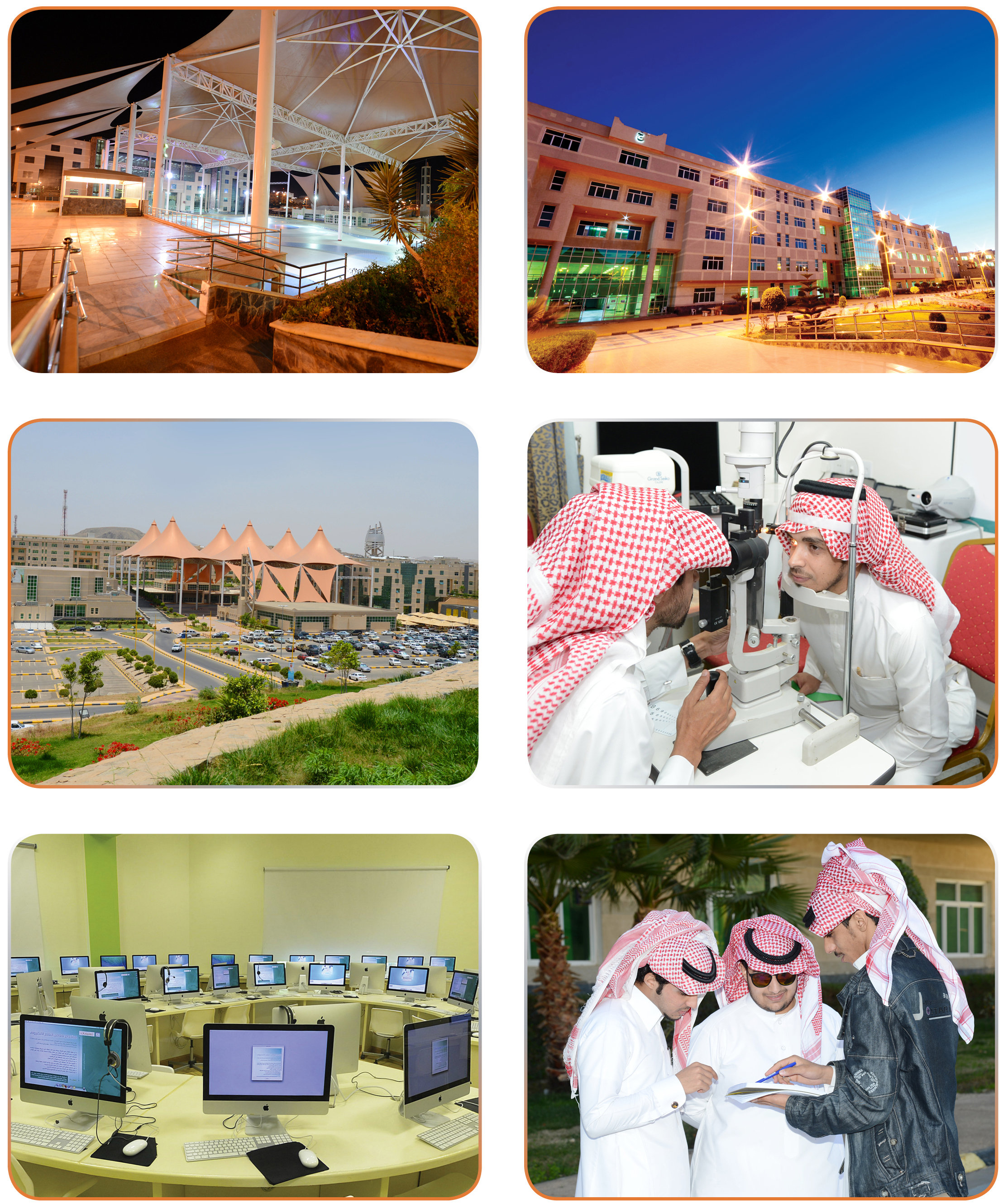
صور من الجامعة
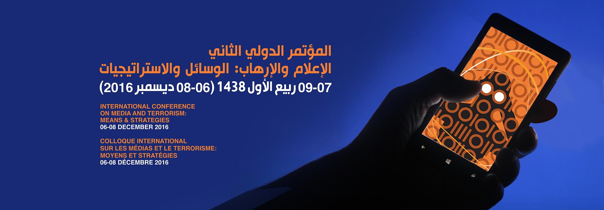
The logo design of the 2nd International Conference on Media and Terrorism: tactics and strategies is the gist of the notion summing up all conference topics, objectives, and perspectives.
Besides any traditional logos or associations known to the worldwide public, the design is a challenge to the idea, a matter that was borne in mind when the logo was designed.
The design was worked out in a way mirroring the concepts governing the relations between terror and mass media.
Terror groups harness modern-day media to promote their own thought and to publicize their criminal practices to the maximum
on one hand, the mass media rush to cover their goings-on worldwide, and on the other, international terrorist organizations "need" this cover age.
This was how the idea of creating the design was crystallized.
As terror and mass media feed off each other in an endless cycle, a man carrying a magnifying glass was the core of logo design.
As for the digits zero and one, they symbolize advanced technology used nowadays.
They mirror the basic values used in intricate calculations processed within a variety of softwares.
Work cannot go smoothly using modern-day communication tools, be they traditional or contemporary, without depending on high technology.
The color orange was chosen as the basic color in the logo as the internationally-recognized warning and alarm symbol uses it to indicate high alerts and potential hazards to protect the general population.
The only color surpassing orange in the five alarm color scale is red referring to the highest alert.
This is why orange was selected. It reflects the current status of the world vis-à-vis international terror.
The other lines surrounding the logo in various colors signify media briskness in covering the goings-on.
Deputy editor in chief, art director
Afaq Newspaper, KKU

جاء تأسيس قسم الإعلام والاتصال بجامعة الملك خالد، ليلبي أفضل متطلبات الاعتماد الأكاديمي، نظرا لأنه الأحدث بين أقسام وكليات الإعلام في الجامعات السعودية.
وقد بنيت خطة القسم لتلبي متطلبات أكاديمية واحتياجات وطنية في مجالات الإعلام والاتصال. ومن أهم ملامح هذه الخطة تطبيق دراسة مكثفة للغة الإنجليزية في أول عام يلتحق فيه الطالب أو الطالبة بالقسم، إضافة الى مواد مركزة في اللغة العربية بهدف رفع مستوى المهارات الكتابية للطلاب.
كما أن التخصصات الثلاثة التي يضمها القسم جاءت بناء على دراسة اتجاهات التعليم الإعلامي في عدد من الجامعات المرجعية في الولايات المتحدة وأوروبا، إضافة إلى تحديد مجالات سوق العمل في المملكة.
ومن أهم ما يميز خطة قسم الإعلام والاتصال تلبيتها متطلبات هيئات الاعتماد الوطنية والدولية، وخاصة ما يتعلق منها بهيكلية المقررات من داخل القسم وخارجه من تخصصات مساندة ضمن فلسفة أن الإعلامي يجب أن يكون ذا ثقافة واسعة في مختلف التخصصات والمجالات ذات العلاقة بالعمل الإعلامي.
وهناك برامج تدزيبية ليست في صُلب خطة قسم الإعلام والاتصال، ولكنها ضمن متطلبات التخرج، ومنها على سبيل المثال، برنامج «التدريب على رأس الدراسة» بهدف تدريب الطلاب والطالبات على نختلف المهارات العملية، وتعميق الجانب التطبيقي للمنهج الدراسي، إضافة إلى زيارات تعريفية وتدريبية للمؤسسات الإعلامية داخل المملكة وخارجها.
والاهتمام الذي يحظى به قسم الإعلام والاتصال يأتي ضمن توجيهات معالي مدير الجامعة بتفعيل المنظومة الإعلامية والاتصالية في الجامعة من تطوير الصحيفة الجامعية الأسبوعية «آفاق» والتي تعتبر الصحيفة الجامعية الأولى بين مثيلاتها في المملكة العربية السعودية والمنطقة، وتأسيس مركز إعلامي مشتمل على أستديوهات إذاعية وتلفزيونية كمعامل لتدريب الطلاب، إضافة إلى تغطيته لكافة احتياجات جامعة الملك خالد في المجال الإعلامي.


